
Continued from Part 2: Cleaning and Part 1: Scraping
The boss is so impressed with what you've done so far and reckons you're up to the next task. Buckle up, it's a doozy.
You are handed a crisp piece of paper with the following requirements on it:
We want to predict a binary variable - whether the salary was low or high. Compute the median salary and create a new binary variable that is true when the salary is high (above the median).
- Start by ONLY using the location as a feature.
- What is the baseline accuracy for this model?
- We would rather predict a low salary when the salary is in reality high than predicting high when in reality it is low (is there any problem with doing this?)
Right this does seem like quite some work. Let's not get overwhelmed, let's break it down and get cracking.
We want to predict a discrete variable i.e the outcome is either one thing or another. We will be using classifying models as opposed to linear regression models which we might want to use if we were predicting the actual salary (a continuous dependent variable). First of all we will establish the median salary from the scraped data
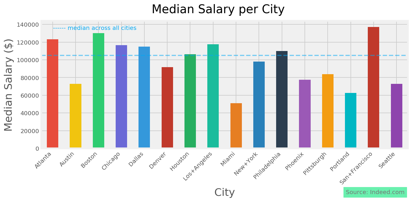
establish the median salary:
median = np.median(df['real_salary'])
# Then let's add a column to our dataframe showing 'High' or 'Low'
df['level'] = df['real_salary'].map(lambda x:
    'High' if x > median else 'Low')
Before we do any modelling, we can already establish the baseline that any of our models need to beat. We would expect that because we are using the median as a split point our baseline would be roughly 50% but we can be more specific. We will look at the value counts in the level column:
df4['level'].value_counts()We see that there are 250 'High' values, and 252 'Low' values. We establish our baseline as the number of the dominant category out of all observations: 252/502 = 0.502. Didn't we guess well!
Modelling
Now we want to start making our first model. Here we want to establish how good a predictor of salary level is the city of the job listing?
We'll start using another python module scikit-learn. This is a package chock full of great tools to build predictive models off of data. It's not a wizard, so we are going to have to add our own magic into the mix to get it predicting:
from sklearn.linear_model import LogisticRegression
from sklearn.model_selection import cross_val_score, train_test_split
There's still more we need to do to get things moving. Sklearn doesn't like dealing with text, it much prefers numbers. Fortunately Pandas has our back again. there's a function called get_dummies() that will turn a categorical column (in this case our 16 cities) into 16 columns with a 1 in each row in the corresponding city column. We also don't want to make our model and not be able to test how good it is.
Training/testing split
Building models is all about training it on existing data so that when we encounter new data we can make a prediction. We will use the sklearn function train_test_split(). This function will allow us to train a model on part of our data to then test on a part of the data it has never seen. If all our models were trained and tested on the same data they would give an excellent score - until they met new data. Enough theory, let's see how we get on.
#establish our outcome matrix
y = df['level']
# establish our predictor's features
X = pd.get_dummies(df['city'])
#split our data into training and testing parts
X_train,X_test,y_train,y_test =
    train_test_split(X,y,test_size=0.2,stratify=(y),random_state=6)
#perform Logistic Regression using sklearn
logreg = LogisticRegression()
# fit our model on the training data
logreg.fit(X_train, y_train)
#using the model, take 5 splits of the test data to,
#make predictions and check against the known outcomes
scores = cross_val_score(logreg,X_test,y_test,cv=5,scoring='accuracy')
#from the 5 iterations of testing, take the average score
print(scores.mean())
We get a number out at the end: 0.58 That looks a bit better than our baseline indicator, but what does it mean?
Accuracy
We can see that when we set the cross_val_score, that we set scoring = 'accuracy'. Accuracy is how good our model is at predicting the outcome correctly out of all predictions. We know that with this model, we are still going to be wrong 30% of the time. We can look at how we are wrong by looking at a 'confusion matrix'
from sklearn.metrics import confusion_matrix
#make the predictions
y_hat = logreg.predict(X_test)
#use the original labels
labels = y.unique()
#generate the matrix
confusion_matrix(y_test, y_hat, labels=labels)
We can see that we have correctly predicted a high level 35 times, and correctly predicted a low level 27 times. There are however some incorrect predictions. We have incorrectly predicted a high when the real value was low 24 times, and incorrectly predicted low when the real value was high 15 times.Confusion Matrix
Predicted High Predicted Low Actual High 35 15 Actual Low 24 27
This is going to help us understand how we can avoid making a high prediction when we don't want to tell clients that a salary is high when it is not. We would see this as a false positive in this case, and we did it 24 times. If we want to change the model to stop predicting these, then we can, but we are going to end up making false predictions elsewhere.
How would we change the model to make fewer of these false positives?
When we perform logistic regression, we are looking at the probability of an observation having one outcome or another. The model uses a threshold of probability of 50% and says that if it is over 50% confident in one category, then that category is predicted. If we want to predict fewer high levels than low levels, we need to raise the threshold for choosing a high value, that is to say we would move from a 50/50 chance of picking high to say 30/70 or 20/80. In this way our model would predict low more frequently, but it would be wrong more often in picking more false negatives (picking low when the value is actually high)
We can take a peek under the hood of the model, to see the probability it assigned each obervation having its given outcome
#look at a slice of the probabilities
logreg.predict_proba(X_test)[30:40]

>>> Outcome:
array([[0.46068609, 0.53931391],
       [0.74754881, 0.25245119],
       [0.45091145, 0.54908855],
       [0.55092748, 0.44907252],
       [0.74754881, 0.25245119],
       [0.43099972, 0.56900028],
       [0.62295166, 0.37704834],
       [0.43099972, 0.56900028],
       [0.62295166, 0.37704834],
       [0.43099972, 0.56900028]])
The left hand column gives the probability of the model having predicted 'high' for that observation. We can see that the 'High' was chosen in 2 cases here with a probability of over 0.7, with 3 being chosen in the range of 0.5 - 0.7. We could perhaps set our threshold for predicting 'High' at 0.7 and see what that gives us in the confusion matrix.
#create a dataframe so it is easier to work with
y_test_df = pd.DataFrame(y_test)
# reset the index so we can append a column cleanly
y_test_df.reset_index(drop=True,inplace=True,)
# show the predictions of the model at the default 50% threshold
y_test_df['prediction'] = logreg.predict(X_test)
#add the probability of 'high' as in predict_proba
y_test_df['prob_high'] =
    [logreg.predict_proba(X_test)[i][0] for i in range(0,len(logreg.predict_proba(X_test)))]
#set a threshold of 0.7 for making 'high' prediction
y_test_df['new_pred'] =
    y_test_df['prob_high'].map(lambda x: 'High' if x > 0.7 else 'Low')
#look at the same section of results as we did before
#to see how the change has affected predicted outcome
y_test_df[30:40]
| level | prediction | prob_high | new_prediciton |
|---|---|---|---|
| Low | Low | 0.460686 | Low |
| Low | High | 0.747549 | High |
| Low | Low | 0.450911 | Low |
| High | High | 0.550927 | Low |
| Low | High | 0.747549 | High |
| Low | Low | 0.431000 | Low |
| High | High | 0.622952 | Low |
| Low | Low | 0.431000 | Low |
| Low | High | 0.622952 | Low |
| High | Low | 0.431000 | Low |
The new column gives us the new prediction where the threshold for prediciting 'high' is over 0.7, we have fewer high predictions.
Let's look at the confusion matrix for this new prediction:
| Predicted High | Predicted Low | |
|---|---|---|
| Actual High | 14 | 36 |
| Actual Low | 6 | 45 |
Excellent, we can see that with the new threshold having been set, we now only predict the salary as high when it is actually low 6 times, which is what we wanted. At the same time however we can see that we have predicted the level as being high only 14 times compared to 35 before, and incorrectly predicted low 36 times in comparison to 15 times before
ROC & Precision-Recall curves
We can see the threshold of our model by looking at an Receiver Operating Characteristic Curve. Here we are looking at the true 'High' rate vs the false 'High' rate. We will draw a dotted line to show the baseline of the model (50% correct rate). In an ideal scenario, our model would predict the outcome correctly 100% of the time (and incorrectly 0% of the time). This would look like a straight line on the graph going vertically from the origin to 1 (for 100%) and at that point becoming horizontal.
Since we are not predicting at 100% accuracy with this model, we can examine the shape our curve makes, and by extension determine the area under this curve as a measure of accuracy.
#generate false positive rate, true positive rate and threshold
fpr, tpr, threshold = roc_curve(y_test == 'High',probs[:,0])

#calculate the area under the curve
roc_auc = auc(fpr, tpr)

#create the plot element on which to display our graph
plt.figure(figsize=[6,6])

#plot a line with points at false positive rate,
    #true positive rate at each threshold
plt.plot(fpr, tpr, label='ROC curve (area = %0.2f)' % roc_auc,
    linewidth=4,color = "#69F0AE")

#plot the baseline (50%)
plt.plot([0, 1], [0, 1], 'k--', linewidth=4,alpha = 0.2)

#set the limits of the plot
plt.xlim([-0.05, 1.0])
plt.ylim([-0.05, 1.05])

#label the axes, add a title and show the legend
plt.xlabel('False High Rate', fontsize=18)
plt.ylabel('True High Rate', fontsize=18)
plt.title('Receiver operating characteristic for "High" Prediction',
    fontsize=18)
plt.legend(loc="lower right")

#show the plot
plt.show()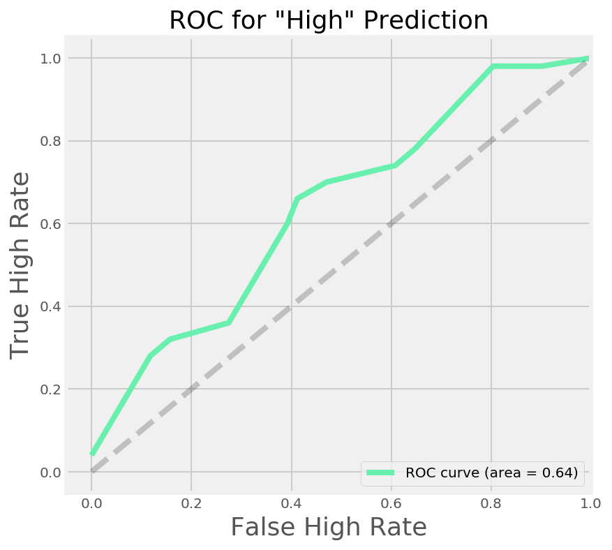
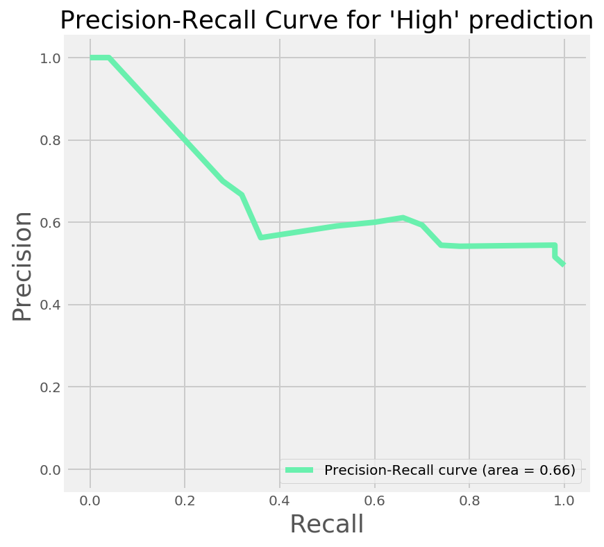
We were however instructed that we don't want to predict a high salary when it is in fact low. When we sacrafice false positives for false negatives, we are increasing the precision of the model, at the expense of the recall.
We can see the precision-recall curve for our model in right hand graph above. I'll save you the code snippet of this one, as it is pretty similar to the chunk above. As our boss wants us to not incorrectly predict a high salary when it isn't we can see that this is possible, however at 100% precision, the maximum recall we can achieve is roughly 5%. This is backed up by looking at the classification with the new predictions vs the actual outcome:
print(classification_report(y_test, y_test_df['new_prediciton']))| precision | recall | f1-score | support | |
|---|---|---|---|---|
| High | 0.70 | 0.28 | 0.40 | 50 |
| Low | 0.56 | 0.88 | 0.68 | 51 |
| avg/total | 0.63 | 0.58 | 0.54 | 101 |
Coefficients
What we really want to know from the model however, is - what do the cities tell us about probability of having jobs above or below the national median based on these job listings? The answer here lies in coefficients.
Let's look at the coefficients our model produces
#show us a dataframe with columns and coefficients
coef_pd = pd.DataFrame(logreg.coef_,columns=X.columns)
#Also show us the classes
print(logreg.classes_)
| Coefficient | |
|---|---|
| Boston | -1.334188 |
| San+Francisco | -1.108065 |
| Dallas | -0.793946 |
| Philadelphia | -0.705349 |
| Chicago | -0.598072 |
| Atlanta | -0.524579 |
| Los+Angeles | -0.226902 |
| Houston | -0.200606 |
| Seattle | 0.135097 |
| Denver | 0.174505 |
| New+York | 0.255290 |
| Phoenix | 0.813763 |
| Pittsburgh | 0.813763 |
| Portland | 0.921457 |
| Miami | 1.141552 |
| Austin | 1.258764 |
The Classes we have are ['High','Low'] This tells us that the model is treating 'high' as if it were our negative, and 'low' as our positive. This first tells us that a negative coefficient will suggest the 'High' category more strongly than the 'Low' category. Always important to check the order of the classes in this kind of model, otherwise you might be drawing the wrong conclusions..
The next thing to look at is the magnitude of the coefficient. The higher in absolute terms (i.e. the further away it is from zero positive or negative) a coefficient, the stronger a predictor you have. We can see here that the strongest predictor for a 'High' salary is Boston. Because our predictors are mutually exclusive, a job is either in boston or not, we can look at the probability that a new job we find in Boston would have a salary over the national median.
We can turn the coefficient (or logit as it is really called) into a probability. This will work in this instance because when we look at one coefficient, we are saying that all the other coefficients will be multiplied by zero (for not Boston).
for this we need this formula: $p = \frac{1}{1+e^{-L}}$
To do this in python:
#take the intercept and Boston coefficient as odds
odds = np.exp((logreg.intercept_-1.334188))
prob = 1/(1+odds)
print(prob)
>>0.7877
Given this, the probability that using our model, any new job we see posted in the Boston area on indeed.com has a salary higher than the national median is 0.79
Much as we'd like to get our feet up, we are on a roll so let's not only focus on location as a predictor of salary, but let's create some other features from the data we scraped and see if we can improve on our abaility to predict.
First up though, time for a cup of tea.
Comments